Tuesday, June 30, 2009

How to Think Like a Great Graphic Designer 4: Paula Scher

The fourth in the series of blog posts where I'm sharing what struck me about each interview from the book, "How to Think Like a Great Graphic Designer" by Debbie Millman.

Que: What do you do when you when you experience the feeling of “eureka” about a design solution and your client doesn’t? How are you able to convince them to see things your way?

Ans: …With one particular client, I made a presentation before I showed any work and logically explained why they had to do what I was presenting. I proved my thesis before presenting creative solutions. I’ve done that a number of times, and I’m getting better at it. It’s a lot of work but I’ve been trying to do this more and more. I know I have the tendency to jump to an answer without taking the time to express the logical steps.
(What a great idea. If more designers could implement this – we would have less opportunity to say that the client does not get it).


I loved the new NYCB logo the moment I saw it - of course it had to be designed by Scher (with Lisa Kitschenberg) of Pentagram and the NYCB's Luis Bravo. The identity aims at giving the company a dramatic, contemporary new aesthetic linked to its legacy and location. According to Scher, it is "designed to be powerful and graceful at the same time, like the company."

Da Noise Funk Poster is legendary - it greatly influenced typography of the '90s - imitation they say is the best form of flattery. © Paula Scher

Monday, June 29, 2009

How to Think Like a Great Graphic Designer 3: Milton Glaser

The third in the series of blog posts where I'm sharing what struck me about each interview from the book, "How to Think Like a Great Graphic Designer" by Debbie Millman.

Que: What’s your first creative memory?
Ans: …I was eight years old, and I had rheumatic fever. I was at home and in bed for a year. In a certain sense, the only thing that kept me alive was this: Every day , my mother would bring me a pound of modeling clay, and I would create a little universe out of houses, tanks, warriors. At the end of the day I would pound them into oblivion and look forward to the next day when I could recreate the world. (my first thought was – wow, what a waste and how destructive)

So I knew that my life was linked. My life and my psychology and my sense of self were linked to making things and the satisfaction that I derived from making things. The fact that I could maintain my attentiveness the whole day to make things was a very powerful stimulus in my life.

Que: How did you feel at the end of the day when you dismantled your creation?
Ans: That was another great part. Dismantling it meant I would have another pound of clay to start again.

Que: So there was no sorrow?
Ans: Quite the contrary. The pleasure was in making it and destroying it. I have never thought about this but basically, I realized that in order to have the experience, I had to eliminate what I had done.

I think that, to some degree, this is part of my character as a designer: To keep moving and not get stuck in my own past. (now it all made sense) This is what I try very very hard to do.

…I think this is the way you stay alive professionally.

The infamous I love New York logo.
© Milton Glaser.

© Milton Glaser.

How to Think Like a Great Graphic Designer 2: Carin Goldberg

This is the second in the series of blog posts where I'm sharing what struck me about each interview from the book, "How to Think Like a Great Graphic Designer" by Debbie Millman.

Speaking of compromise, I remember for my first job at CBS Records, I hired Milton Glaser to do an illustration for a Carole King ad. As I was dialing his phone number, I was shaking in my boots. It was like calling the pope. (Wow, It was heartening to learn that even Carin Goldberg was once scared of) I remember I rang him up, and I asked him to an illustration for a full-page ad for Carole King. He sent me an illustration that was–well, let’s say it wasn’t his best. I knew it, even though I thought of him as God’s gift to the universe. So I called his rep and told him we were hoping he’d give us something different.

Milton absolutely refused. He just said, “Sorry, what you see is what you get.” And I went home and cried and didn’t sleep for a week because I thought I had offended Milton Glaser. It wasn’t until many years later that I realized that he had done the right thing by standing up for what he thought was right. If you don’t people will take everything you have. You may risk loosing a job, but in the grand scheme of things, I believe that by standing up for yourself, you’re doing the graphic design business a service.

© Carin Goldberg. New York Times Magazine key cover: Rem Duplessis, art director of the Times Magazine, asked Goldberg to create the cover for the premier issue of key, a magazine focusing on real estate. Duplessis’ only request was that Goldberg somehow use the image of a key. Goldberg chose to create her key by using addresses of all the places she had lived throughout her life. The type mimics the ubiquitous labels used on urban apartment doors and buzzers.

© Carin Goldberg

Friday, June 12, 2009

How to Think Like a Great Graphic Designer: Michael Beirut

I just finished reading this awesome book "How to Think Like a Great Graphic Designer" by Debbie Millman. It's the only book that I'm re-reading. I went right from the last page back to the first page. The candid nature of the interviews and the different perspectives each designer brings to the same questions is what I loved most. To note the similarities and differences across the board of these creatives has been a thrilling read.

In a series of blog posts I want to share with you what struck me most from each designer's interview.

Starting with Michael Beirut:

“When I first started talking directly to clients, I had some moments where I got so obsessed with obtaining approval about a project that I mistook that for doing the job right. By the time one project was about to go to press, I remember my boss – Massimo Vignelli–saying to me, “What is this?” And I said, “This is a job for so-and-so.” And he said, “Why does it look this way?” And I started to say, “Well, they did this, and then they did that, and it had to be this,” and he said, “No, this is awful. We can’t let this go.” He picked up the phone at my desk and called up the boss of the boss of the boss of the guy who had been jerking me around for weeks and said, “You know this thing you’re doing for the blah blah blah? I’m not sure it’s quite right. I want to do it right. We’ll send it over after we do one more thing to it. We have time right?” Then he sat there and scraped off all the shit that had accrued on it over the past three weeks and did something crops and right and perfect.

Massimo had this saying: Once a work is out there, it doesn’t really matter what the excuses were.” It doesn’t matter if you didn’t have enough time or if the client was an idiot. The only thing that counts is what you’ve designed, and whether it’s good or bad. These are words to live by.”

If you haven't read this book - you can treat this series of blog posts as excerpts. And if you have read it - share with me your thoughts and your take aways.

The Seduction symposium poster designed by Michael Bierut and Marian Bantjes for the Yale School of Architecture.
© Michael Beirut.

“Light Years” poster, The Architectural League of New York, New York, NY, 1999.
© Michael Bierut/Pentagram,

Thursday, June 11, 2009

A talk about Social Networking

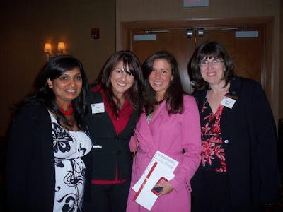
Last week, I was a panelist at the annual Spring Forum for the Women's network at Kodak. Along with my buddy Tina (@tostina) and Mary Irene (@maryirene) I (@shrutigoradia) spoke to a full house of over 150 Kodak employees about how the 3 of us use Social Media personally and professionally.

Mary Irene blogged about it on the Kodak blog. Check it out.